
Mar 29•9 min read
The Bluff That Broke the Dollar

Black swans.
Six sigma events.
The tail risks you never knew existed.
Unforeseen disasters that sneak up and hit your blindside harder than Bill Romanowski in his prime on an otherwise idle Tuesday.
If you’re like me and grew up in 21st-century America, you know the sort of trauma I’m describing all too well.
On average, most generations live through one, maybe two such events in a lifetime. Us? Well, our list is rather long and growing stranger by the day. To name a few:
September 11, 2001
U.S. invasion of Iraq, 2003
Global Financial Crisis, 2008
COVID-19 lockdowns, 2020
And most recently, the global banking failures of 2023
But what if I told you there was a common thread of data that warned of all these dangers ahead of time?
A reliable pattern that can tell us when it’s time to relax, and when it’s time to be on guard against the worst.
That warning signal is hidden in plain sight on the U.S. Dollar Index (DXY) chart, an asset whose market prescience puts Nostradamus to shame.
I say this because every one of the tragedies listed above have occurred after DXY suffered a breakdown below its 200-day moving average.
Remember that dollar death cross we discussed back in January? Turns out it may have been warning us about much more than mere price swings.
How or why the dollar’s technicals have been able to reliably forecast catastrophe is anybody’s guess, but the pattern is undeniable.
In the words of legendary trader Paul Tudor Jones:
My metric for everything I look at is the 200-day moving average of closing prices. I’ve seen too many things go to zero. The whole trick in investing is: “How do I keep from losing everything?” If you use the 200-day moving average rule, then you get out. You play defense, and you get out.
With this reverence of market wisdom in mind, today let’s once again analyze the technical data of DXY and BTC into the end of Q1 2023, as we seek to determine which of these will hold the upper hand in Q2 and possibly beyond.
The Dollar - Destroyer of Worlds
If you recall the last time we discussed DXY, I mentioned two specific factors that would clue us in on whether the Fed was holding a winning hand or simply bluffing its way to a stronger dollar.
Those two factors were the implied terminal rate (the market’s expectations of how high the Fed will raise rates in 2023), and DXY’s technical resistance at 105.65.
I explained that if terminal rates continued rising, while DXY simultaneously broke and held above 105.65, crypto markets would be headed for a world of pain.
Turns out, it wasn’t crypto that got bludgeoned by the dollar wrecking ball but rather the U.S. banking system.
As we’ll see below, on March 7 while Fed Chair Powell was testifying in front of Congress that he would continue the fight against inflation by any means necessary, the market got busy calling his bluff.
It took his jawboning literally, which spiked the implied terminal rate from 5.4% up to 5.7%. That move up in rates then sent DXY (blue line below, right axis) surging above the key resistance level we outlined at 105.65 (top white line).
From there, the wrecking ball did what it does best.
Renewed dollar strength sparked an immediate flight to cash and triggered nationwide bank runs, which led to Silicon Valley Bank (SVB, orange line, left axis) among others falling into an immediate FTX-esque death spiral.
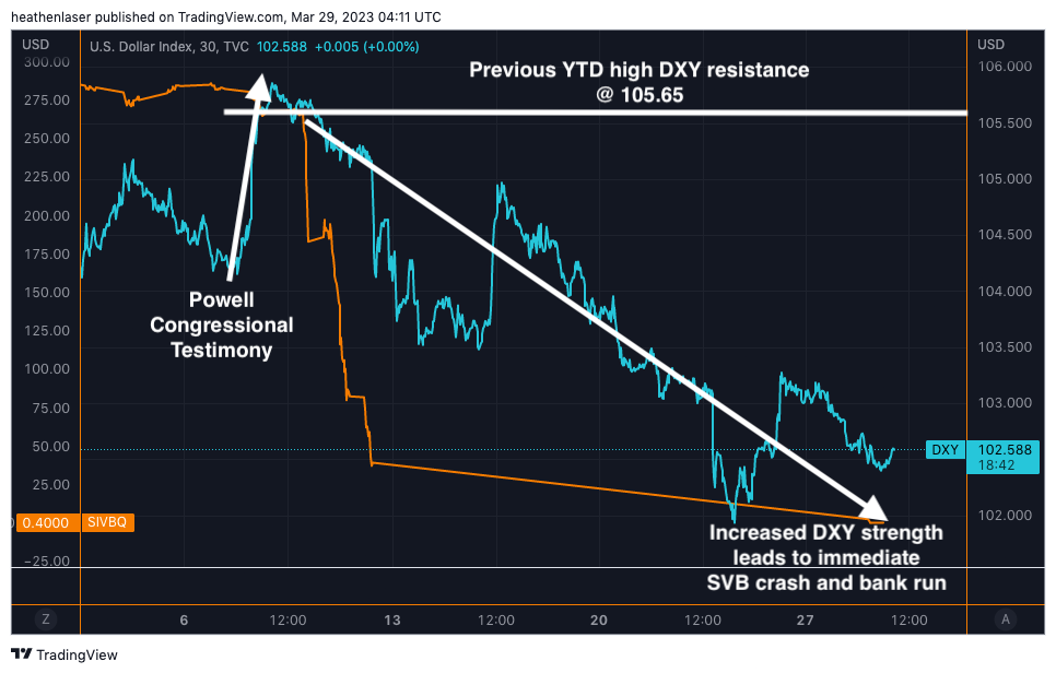
This was because SVB, like FTX, had its customer’s’ deposits tied up in illiquid assets whose market value was worth less than SVB’s balance sheet claimed. Meaning when cash suddenly became a hot commodity, they didn’t have enough of it on hand to make everybody whole and the market knew it. A variable the Fed’s models failed to account for while viciously hiking rates.
SVB, which held some $210 billion of paper assets prior to the crash, saw its stock price collapse from over $275 on Monday to nearly $0 by Friday of that same week when the FDIC stepped in to seize it.
And though SBV was the most notable, it was also far from the only bank affected by this sudden spark of DXY demand. These widespread failures forced the Fed to intervene and inject liquidity via its Bank Term Funding Program (BTFP) in order to avoid a total financial apocalypse.
Be careful what you wish for, Monsieur Powell.
The subsequent DXY drop-off you see above can be attributed to that liquidity injection, along with rate markets dropping off a cliff.
The chart below shows how after DXY broke the banks, rate markets broke DXY, as the implied terminal rate plummeted nearly 20% from a high of 5.7% to lows near 4.7%.
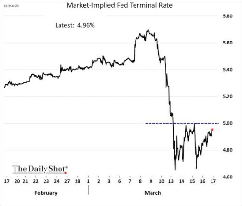
This volatility in rate markets painted a perfect technical picture on DXY’s chart.
When rates were rising, it gave fuel for a dollar dead cat bounce, which led to DXY temporarily reconquering its 50-day (green line) and 100-day (blue line) daily moving averages (DMAs).
However, the crash in rate markets stopped DXY’s rally in its tracks before it could reach the ever crucial 200-day DMA (red line, the one macro traders like Paul Tudor Jones rely on for trend confirmation).
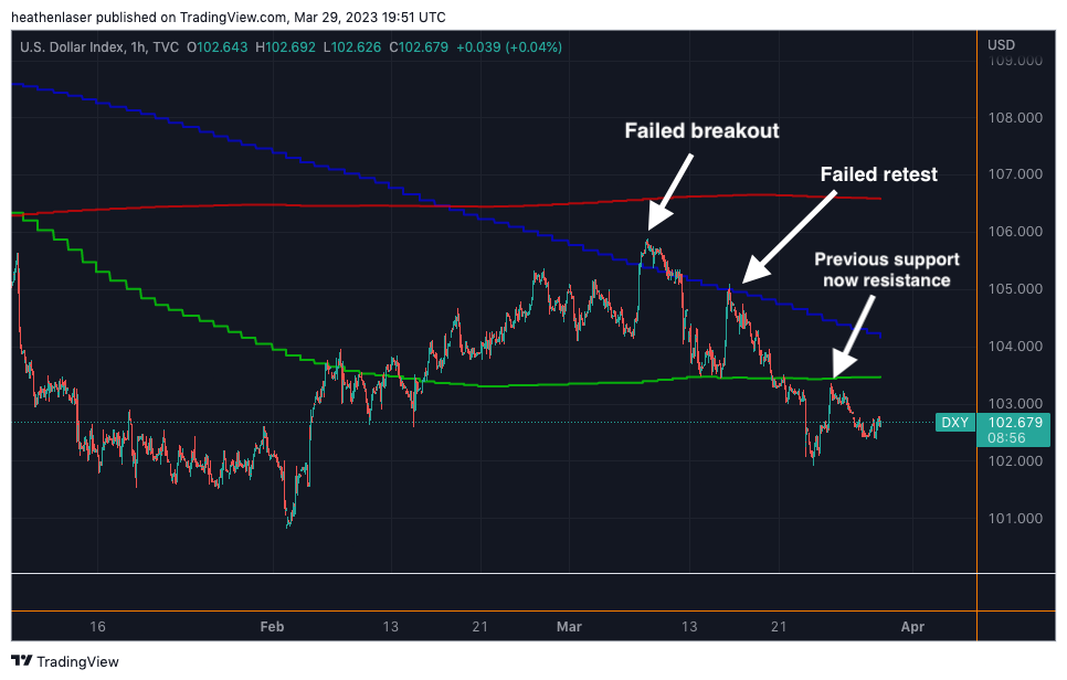
To make matters worse, we now see that the 50- and 100-day DMAs have become resistance, and an ominous “head and shoulders” pattern is forming on the 1H chart – a possible sign of more downside to come.
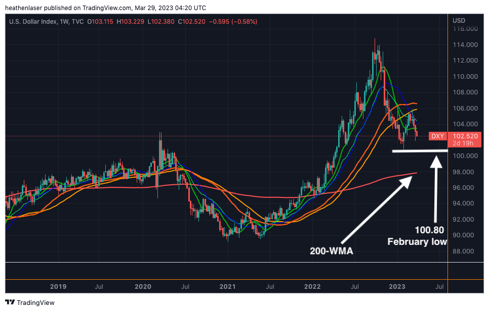
The more we zoom out, the more dire things look for our dollars if DXY is unable to recover its lost moving averages in April.
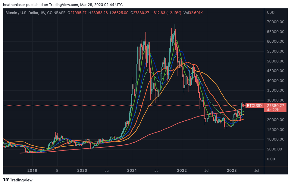
As we see below, DXY is currently beneath almost all major MAs on both the weekly and daily charts. There are now only two thin lines of support left standing between its current 102.50 level, and the sub-90 lows of early 2021.
Should the February low at 100.80 (white line) and the 200-day weekly moving average (WMA) around 98 (pink line) fail to hold, price will almost certainly retest 2021’s bottom by year’s end.
And while I’m not a believer in Balaji’s Bitcoin to $1 million meme, it would be equally foolish to throw the baby out with the bathwater and ignore the historic correlation between broken DXY technicals and black swan events in the U.S.
Perception is reality, and when we view the dollar through this objective lens of data, we see the market telling us that this is an asset that looks more like a burning building than a safe haven.
If only there was some sort of fixed-supply, decentralized alternative with more favorable charts we could diversify into…
Gimme Shelter
As has been the constant theme of my articles in 2023: There is no catalyst more powerful for Bitcoin’s growth than DXY devaluation.
When the dollar (blue line) goes down, Bitcoin (orange line) goes up.
And when the dollar goes up, Bitcoin goes down.
Simple as.
Neither is a consistent store of value. Rather, their appreciation and depreciation cycles versus one another rotate in a rather volatile fashion.
But don’t just take my word for it, here’s five years of that constant visualized:
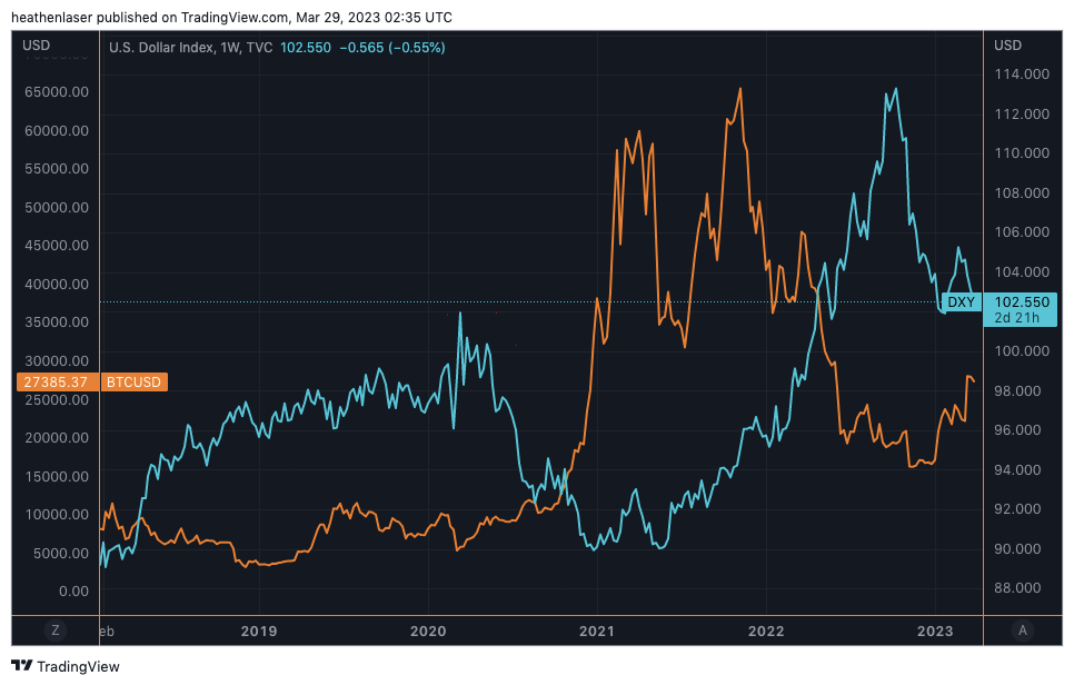
This means that in times of dollar distress like we’re living through now, Bitcoin offers shelter from the storm of monetary debasement.
Additionally, we can see further evidence of this inverse correlation taking place when we compare Bitcoin’s current technical structure to DXY’s.
While the dollar charts we reviewed earlier look like a cautionary tale in the making, Bitcoin looks like an asset in the earliest stages of a macro breakout.
Below, we see how despite the turbulence of early March, Bitcoin not only maintained its bull market structure when it held the 200-day DMA (red line), it further advanced it by making a clean break of February’s resistance level (200-day WMA, pink line) the following week.
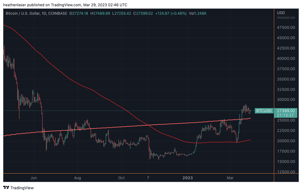
Now when we zoom out, we see BTC is above all of its key MAs on both the weekly and monthly charts for the first time since November 2021, when it was trading above $60,000.
That’s in contrast to DXY, which is on the verge of falling below all of its MAs for the first time since May 2021.
There’s also the fact that March 10’s perfect retest of support followed by a subsequent move higher is identical to the behavior of early-stage bull runs past that we documented in February’s article “Don't Get Shaken Off Bitcoin’s Golden Bull”:
Historically, there are few signals more potent than the golden cross. As a positive leading indicator for Bitcoin, it has led to higher prices 100% of the time.
However, there is one caveat.
After each cross, we found that prices drop harshly in the near term, and the market suffers through a brutal shake-out period before it reaches new highs.
This shake-out period allows for cementing of the new trend before the arrival of a full-blown bull market.
I don’t know what else you’d call early March other than an absolutely brutal shakeout, but if you were cowboy enough to remain on the bull the whole way through, you’ve earned my respect.
And as we discussed a couple weeks back, now that the Bitcoin volatility index is only just beginning its breakout, there’ll undoubtedly be more mind-melting whiplash price action ahead.
The journey to higher highs won’t be linear, but when weighed against the unknown unknowns of an ultra-bearish DXY, I like Bitcoin’s chances of prevailing in Q2.
What do you guys think?
Comment below or let me know on Twitter @JLabsJanitor.
Your friend,
J.J.